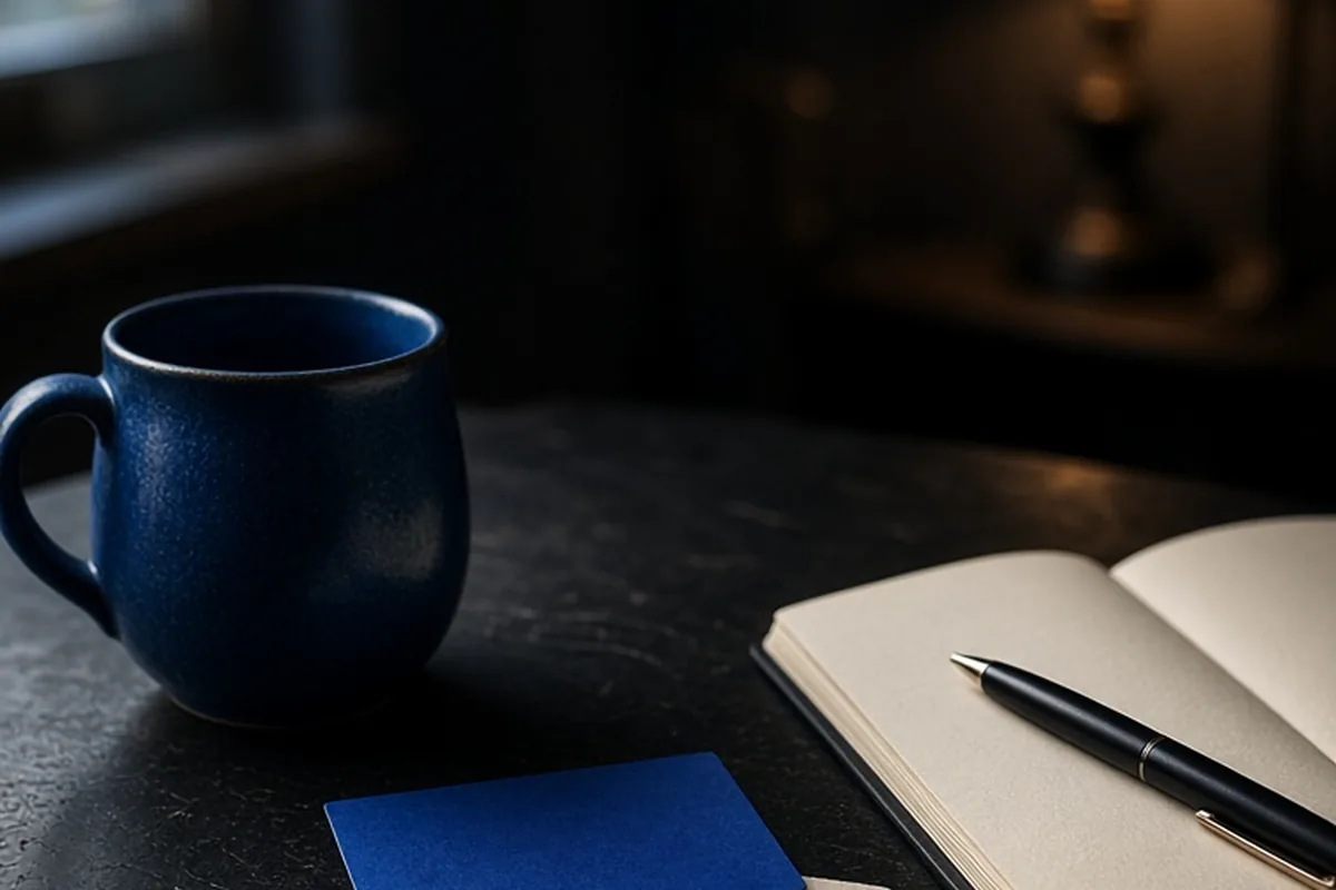
Your favorite color often reflects subconscious emotional needs, personal energy, and preferred environments rather than a rigid psychological diagnosis. People drawn to cool tones like blue or green frequently prioritize calm, stability, and thoughtful reflection, while those favoring warm hues like red or yellow tend to gravitate toward action, social engagement, and expressive living. Knowing your preference helps clarify your personal comfort zones and daily lifestyle choices.
While color preferences are not fixed clinical indicators of character, they provide an intuitive shorthand for exploring individual temperament, aesthetic comfort, and emotional priorities in everyday life.
Cool Tones: Blue, Green, and the Preference for Equanimity
A natural inclination toward cool colors such as deep navy, sky blue, or forest green typically signals a strong desire for emotional balance, consistency, and mental order. Individuals who select blue as their primary color often place significant value on dependable relationships, clear communication, and peaceful environments. They frequently process information methodically before speaking, seeking to avoid unnecessary chaos or rash decisions. Green enthusiasts share this grounding energy but often combine it with a pronounced affinity for renewal, nature, practical problem-solving, and personal growth.
In day-to-day settings, a blue or green leaning manifests in how a person structures their workspace or approaches conflict resolution. For instance, a professional who favors cool palettes might establish structured daily routines and gravitate toward mediating disagreements through calm, objective conversation rather than high-stakes confrontation. However, a potential trade-off of this temperament is a tendency toward overthinking or resisting sudden change. When maintaining harmony becomes an absolute priority, individuals favoring these shades might occasionally hesitate to take bold risks or express dissenting viewpoints openly.
Warm Tones: Red, Orange, and High-Energy Engagement
Choosing intense warm shades like vibrant red or energetic orange reflects an outward-facing temperament driven by action, physical presence, and direct expression. Red is traditionally associated with decisiveness, passion, ambition, and a competitive spirit. People who gravitate toward red usually feel energized by challenges, moving quickly from ideas to execution without getting bogged down by prolonged deliberation. Orange combines this assertive drive with spontaneous social enthusiasm, highlighting a personality that enjoys group dynamics, creative ventures, and lighthearted humor.
Consider an individual planning a community event or managing an ambitious project. Someone who identifies strongly with orange or red will often take charge effortlessly, infusing the group with enthusiasm and pushing past initial obstacles through sheer momentum. The limitation associated with this high-energy profile involves patience and follow-through on routine tasks. Because these individuals thrive on novelty and stimulation, they may find extended periods of solitude, slow administrative work, or gradual consensus-building somewhat draining and frustrating.
Bright and Cheerful Hues: Yellow, Pink, and Expressive Warmth
Lighter, radiant colors such as bright yellow or gentle pink suggest a personality orientation centered on optimism, relational warmth, and creative optimism. Yellow admirers frequently possess an active, intellectual curiosity combined with an upbeat approach to problem-solving. They are often the individuals who generate inventive ideas in brainstorming sessions, viewing setbacks as temporary puzzles rather than permanent roadblocks. Pink, conversely, emphasizes nurturing affection, empathy, approachable charm, and an innate desire to create welcoming atmospheres for others.
An everyday example is someone who uses vibrant yellow notebooks and bright home decor to cultivate an uplifting environment that sparks conversation and lifts the mood of visitors. In social situations, pink and yellow personalities tend to act as natural encouragers, actively seeking common ground and celebrating others' successes. A notable drawback, however, can be an aversion to difficult emotional realities. In an effort to keep interpersonal environments pleasant and positive, individuals drawn to these tones might occasionally minimize their own grievances or avoid uncomfortable, necessary boundaries.
Deep and Introspective Shades: Purple, Indigo, and Individuality
Those drawn to rich tones like purple, violet, or dark indigo often emphasize creative independence, intuition, and a personal sense of individuality. Historically associated with depth and contemplation, purple appeals to people who enjoy exploring unconventional ideas, philosophical concepts, and distinct personal styles. Rather than adhering strictly to mainstream conventions, purple enthusiasts usually appreciate nuanced storytelling, artistic expression, and meaningful one-on-one connections that go beyond superficial chatter.
For example, when decorating a room or curating a personal project, someone who loves purple might incorporate layered textures, vintage accents, and eclectic art that tell a specific personal story. They tend to observe social situations carefully before fully engaging, valuing authenticity above broad popularity. The corresponding challenge often relates to feelings of being misunderstood or emotionally guarded. Because their internal world is rich and complex, they may struggle to explain their intuitive choices to peers who prioritize strictly linear or conventional thinking.
Neutrals and Earth Tones: Black, White, Gray, and Grounded Minimalism
An attraction to neutral palettes like stark black, crisp white, muted gray, or rich earthy brown points to a strong preference for clarity, self-containment, and functional simplicity. A preference for black often reflects personal authority, private boundaries, and a sophisticated, non-distracting personal aesthetic. White signals a desire for mental clarity, fresh starts, and uncluttered organization, while gray and brown highlight pragmatic stability, dependability, and an appreciation for lasting quality over temporary trends.
In practice, a person dedicated to neutral tones might curate a capsule wardrobe or maintain a minimalist home where every object serves a distinct functional or aesthetic purpose. This intentional restraint helps minimize sensory overload and allows them to focus their energy on core priorities. The potential trade-off is that very heavy reliance on neutrals can sometimes convey emotional detachment or an unyielding need for control. When life becomes unpredictable, these individuals may need to consciously practice flexibility and welcome occasional spontaneous messiness.
How Context and Life Stages Shift Your Color Alignments
Color preferences are rarely static markers set in stone; rather, they tend to evolve alongside personal maturity, changing stress levels, and shifting environmental needs. A person who spent their twenties surrounded by bold, vibrant reds and oranges while establishing an active social life might find themselves naturally migrating toward gentle blues, soft sages, or muted neutrals in their thirties or forties as their priority shifts toward domestic calm and restorative downtime.
Cultural background and professional environments also exert a strong influence on how colors are perceived and chosen. For instance, someone working in a high-stress emergency setting might gravitate toward calming earth tones in their private home to decompress from visual overstimulation. Recognizing that color choices can shift depending on your current chapter of life prevents you from viewing personality traits through an overly rigid lens, encouraging you instead to use color as a responsive tool for emotional well-being.
Applying Color Insights to Personal Spaces and Routines
Understanding what your favorite colors say about your tendencies enables you to intentionally design your surroundings to support both your strengths and your vulnerabilities. If you recognize that your love for cool tones helps you concentrate, you can deliberately paint your home office in soft blue or slate green. Conversely, if you notice that an overabundance of cool gray makes your mornings feel sluggish, you can strategically introduce warm accents like amber lighting or terracotta ceramics to inject vitality.
The most effective approach involves balancing your primary color preference with complementary shades that address your secondary needs. Rather than committing entirely to one hue, consider how different spaces serve different functions in your daily rhythm. A high-energy workout area or creative kitchen corner might benefit from energetic warm highlights, while a bedroom or reading nook remains anchored in soothing, restorative tones that support restful evenings.
Frequently asked questions
Can your favorite color accurately predict your future success or career?
No, color preferences reflect personal aesthetic tastes and general emotional tendencies rather than aptitude or future performance. They are helpful for self-reflection and spatial design, but career outcomes depend on skills, effort, and opportunity.
Why does my favorite color change depending on the situation?
It is completely normal to prefer different colors for clothing, home decor, and personal accessories based on functional needs. Context determines whether you are seeking stimulation, professional authority, or emotional relaxation at any given moment.
Does having multiple favorite colors indicate an inconsistent personality?
Having multiple favorite colors simply indicates versatile interests and an adaptable temperament. It shows that you appreciate varied emotional energies across different areas of your everyday life.
Your next step
Choose one room or dedicated corner in your home this week and adjust its accent colors to intentionally match the specific mood and energy you want to experience in that space.