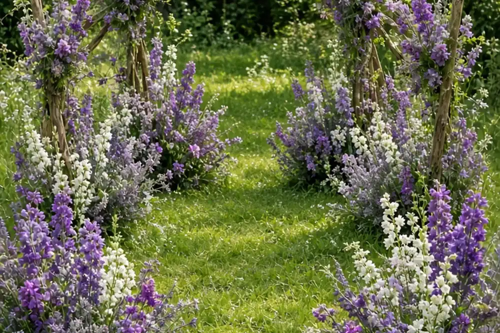
To create a stunning purple-themed wedding, anchor your aesthetic with a curated multi-tone palette—such as deep plum, soft lilac, and warm neutrals—rather than relying on a single uniform shade. Distribute color strategically across focal areas like floral arrangements, ambient uplighting, stationery, and textured table linens. Balancing bold violet or berry accents with muted tones like taupe, cream, or sage prevents visual overload and creates a cohesive, refined atmosphere across your ceremony and reception spaces.
Purple carries exceptional versatility in event design, moving easily between moody autumnal opulence, crisp modern minimalism, and soft, garden-inspired romance depending entirely on your choice of undertones, textures, and lighting.
Curating a Multi-Dimensional Purple Palette Across Varying Tones
A common pitfall when designing a purple-themed wedding is choosing a single, flat shade and attempting to match every element to that exact swatch. Saturated colors like royal purple or bright violet can quickly overwhelm a venue when repeated identically across linens, bridesmaid dresses, paper goods, and florals. High-end event design relies instead on tonal depth. By treating purple as a spectrum rather than a single color, you create visual movement that feels layered and intentional. Consider anchoring your concept around three complementary values: a dominant base, an accent highlight, and a grounding neutral.
To build a romantic, ethereal aesthetic, combine pale wisteria, dusty lilac, and mauve with warm ivory, soft gray, and accents of faded sage. If your goal is dramatic, black-tie luxury, pair deep aubergine, midnight plum, and rich blackberry with matte black, espresso, and metallic brass or antique gold. For a fresh, contemporary botanical look, contrast vivid magenta-violet and iris purple against olive greens, crisp linen white, and accents of warm ochre. When testing your swatches, review fabric, ribbon, and paper samples under both natural daylight and warm artificial lighting, as purple undertones can shift drastically from warm reddish-burgundy to cold bluish-slate depending on the light source.
Selecting Natural Purple Wedding Flowers by Season and Texture
Florals provide the most organic medium for displaying purple, because natural botanical specimens naturally feature varied gradient shifts, delicate veins, and subtle color breaks. Relying on naturally occurring blooms avoids the stiff, artificial look of artificially dyed stems, which also carry the risk of transferring color onto bridal gowns or suits during portraits. When consulting with your floral designer, focus on seasonal varieties to secure the best bloom health, scent, and structural fullness.
In spring, lean on fragrant lilacs, sweet peas, hellebores, anemones with dark centers, and Dutch tulips ranging from pale lavender to near-black purple. Summer weddings offer abundant access to delphinium, lisianthus, clematis, scabiosa, and garden roses with dusty plum undertones. Autumn and winter celebrations benefit from the velvety depth of dark calla lilies, deep purple dahlias, vanda orchids, and textural elements like privet berries, smokebush foliage, and dark purple agonis leaves. Mixing broad, soft petals with fine, trailing greenery and structural branches ensures your arrangements feel loose, artistic, and modern rather than dense and uniform.
Structuring Ceremony Arches and Aisle Decor for Photographic Contrast
Your ceremony setting establishes the visual tone for the entire wedding day, making it essential to frame the altar space thoughtfully against your natural environment. The primary objective is to highlight the couple without creating a dark, visually heavy backdrop that absorbs camera flashes or blends indistinguishably into dark indoor wood. If your ceremony takes place outdoors against lush grass or dense trees, deep purple florals require a high percentage of cream, blush, or soft lilac blooms to keep the installation distinct and legible in wide-angle photographs.
For ceremony arches, consider an asymmetrical installation that allows the natural structure or background landscape to breathe. Meadow-style floral arrangements lining the aisle offer a contemporary alternative to traditional tied pew markers. By placing ground-level floral clusters featuring mixed heights of purple larkspur, lavender foliage, and white snapdragons, you frame the processional walk in soft botanical layers. If your venue features dark walls or stone interiors, avoid heavy purple fabric drapes behind the altar; opt instead for airy, neutral fabrics paired with concentrated floral bursts and warm candlelight at the base to lift the space.
Styling Reception Tablescapes With Textured Linens and Glassware
Reception tables represent where guests spend the majority of their evening, making tactile quality and eye-level balance critical. Rather than placing vivid purple polyester tablecloths on every table—which can feel dated and visually intense—use texture and selective color placement to evoke luxury. A washed linen, velvet, or raw silk tablecloth in dusty mauve or deep fig introduces sophisticated color while softening the room. Alternatively, keep base linens crisp white or natural oat, using purple selectively in runners, napkin folds, dinnerware, or glassware.
Colored vintage-pressed goblets in amethyst or smoky plum add a jewel-toned spark to each place setting without cluttering the center of the table. Pair these with warm metallic flatware, such as brushed gold or matte champagne bronze, which naturally complements the cool undertones of violet. When designing menus and place cards, consider deckle-edged handmade paper in soft gray-lavender, pressed with dark plum wax seals or written with blackberry calligraphy ink. This subtle application draws guests into the color story through refined details rather than overwhelming broad surfaces.
Managing Uplighting and Candlelight to Avoid Harsh Color Casts
Lighting directly dictates how your color palette appears on camera and in person. One of the most frequent technical mistakes in purple-themed receptions is utilizing aggressive, monochromatic magenta or ultraviolet LED uplighting across the entire room. Intense blue-violet uplights cast unnatural shadows onto guests, distort natural skin tones, turn white dinnerware an odd neon hue, and create severe color-correction challenges for your photographer and videographer.
To achieve a warm, romantic environment, insist on a two-tier lighting plan. Request that your lighting technician program perimeter wall washes in a delicate, desaturated lavender or warm rose-gold wash, while keeping overhead dance floor and dining lighting in warm white or soft amber tones. Pin-spotting each dining table centerpiece with a warm, narrow beam keeps floral arrangements vividly illuminated in their true natural colors. Layering abundant clear glass votives, taper candles in brass candlesticks, or floating cylinder candles along banquet tables injects flickering warmth that balances purple's cool baseline.
Coordinating Attire Across the Wedding Party Without Over-Matching
Dressing your wedding party in identical, saturated purple dresses and matching vests can flatten the visual presentation in group portraits. A sophisticated approach embraces tonal gradation or varied fabrics. For bridesmaids, consider assigning a cohesive palette of three related shades—such as blackberry, dusty mauve, and iced lilac—allowing each person to select a hue and silhouette that complements their individual skin tone and preferences. Alternatively, keep dresses in a single neutral shade like champagne or slate, introducing purple solely through vibrant bouquets and floral hairpins.
For the groomsmen and partners, avoid shiny purple satin vests, ties, and pocket square sets, which can resemble standard prom rentals. Instead, pair classic black, midnight navy, or charcoal wool suits with silk ties in rich plum, aubergine, or subtle lavender micro-patterns. A groom looking to make an intentional sartorial statement might opt for a tailored dinner jacket in deep plum or dark berry velvet for an autumn or winter evening event. Boutonnieres should echo the bridal bouquet with a delicate sprig of lavender, a dark hellebore, or a single lisianthus bloom wrapped in neutral raw silk ribbon.
Incorporating Signature Cocktails, Cakes, and Paper Goods
Day-of culinary and experiential details provide playful touchpoints to tie your purple theme together without relying on synthetic dyes. Your cocktail hour offers an immediate opportunity for creativity. Work with your caterer or mixologist to craft signature drinks featuring natural infusions, such as an Empress gin and tonic that displays an indigo-to-violet transformation with citrus, a blackberry-thyme bourbon smash, or a sparkling lavender French 75 garnished with fresh sprigs.
For your wedding cake, discuss natural finishes with your baker. A smooth fondant or semi-naked buttercream cake serves as an elegant canvas when adorned with cascading fresh purple figs, blackberries, dark grapes, and edible pressed violas or pansies. Alternatively, request a delicate watercolor wash of edible violet luster dust around the base tier. Carry this thoughtful curation through to your signage: acrylic or matte cardstock welcome boards in muted taupe with deep aubergine typography, or dark plum velvet seating chart boards with pinned parchment cards, creating a tactile and memorable greeting for arriving guests.
Frequently asked questions
What colors pair best with purple for a wedding?
Purple pairs exceptionally well with muted neutrals like taupe, warm ivory, and slate gray to keep the setting sophisticated. For contrast, soft sage or olive green emphasizes botanical freshness, while brushed gold or antique brass adds warmth to deeper jewel tones like plum and aubergine.
How can I prevent purple wedding decor from looking dated or overwhelming?
Avoid using a single bright shade of purple across all major elements like tablecloths, chair sashes, and lighting. Instead, layer varied shades from pale lilac to dark plum, mix in high-texture natural fabrics, and limit saturated color to florals, glassware, and small paper accents.
Can purple work well for an outdoor summer wedding?
Yes, purple thrives in outdoor summer settings when focused on soft, airy tones like lavender, lilac, and dusty wisteria paired with abundant greenery and crisp whites. Incorporating seasonal blooms like delphinium, lisianthus, and clematis prevents the palette from feeling too heavy for warm weather.
Your next step
Order physical swatches of your intended linens, stationery paper, and ribbon accents, then examine them together under natural daylight and your venue's evening lighting before committing to floral stem orders.