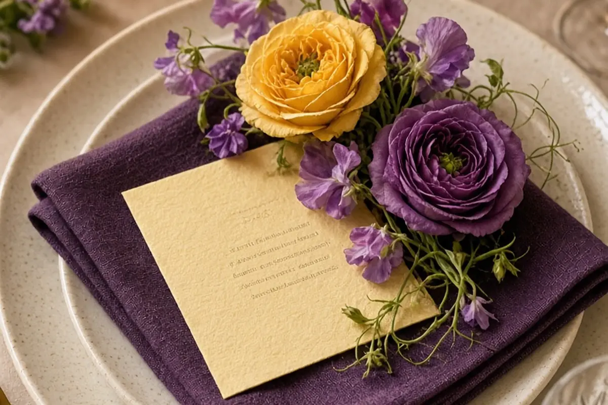
Purple and yellow wedding themes achieve timeless elegance when you pair complementary tonal depths rather than high-contrast primaries. Instead of neon brights, combine grounding hues like deep plum, regal violet, or soft lavender with warm accents like champagne, honey, ochre, or buttercup. By selecting one dominant color family, using the opposing shade as an intentional accent, and bridging them with warm neutrals or lush greenery, you create a refined, balanced aesthetic that feels classic across any season.
Because purple and yellow sit directly opposite each other on the color wheel, they create an innate optical tension that immediately draws the eye. When executed thoughtfully, this complementary pairing brings exceptional depth, warmth, and visual sophistication to ceremony settings, reception tables, and bridal attire.
Pairing Complementary Tonal Values to Avoid a Sports-Team Aesthetic
The biggest challenge couples face when working with purple and yellow is avoiding the appearance of a sports franchise, a juvenile birthday party, or a spring holiday basket. This issue happens almost exclusively when two saturated primary or secondary shades, like pure royal violet and school-bus yellow, are combined in equal fifty-fifty proportions. Pure saturated opposites vibrate against each other, creating visual friction that overwhelms camera sensors, table settings, and guests' eyes. Timeless elegance relies on altering the value, saturation, and proportion of both colors so that they hold a nuanced conversation rather than compete for attention.
To establish a mature foundation, pick one shade to serve as your foundational anchor and let the second shade serve as a supporting accent. For an opulent, moody atmosphere, ground the room with deep blackberries, plums, and aubergines, then introduce light through pale lemon chiffon, spun butter, or soft champagne accents. Conversely, if you prefer an airy, daytime garden atmosphere, allow butter-yellow, cream, and soft ocher to carry the bulk of your linens and paper goods, while introducing lilac, wisteria, and mauve through delicate floral gestures. The addition of bridging neutrals such as ivory, taupe, raw linen, and foliage greens further breaks up the direct contrast and allows the complementary shades to harmonize seamlessly.
Consider temperature matching as your secondary filter. Purples can lean either cool with blue undertones, such as periwinkle and iris, or warm with red undertones, such as burgundy and fig. Yellows range from cool lemon sherbet to warm saffron, marigold, and antique gold. Pairing a warm plum with a warm Tuscan mustard creates an earthy, inviting harmony suited for vineyard and autumnal weddings, whereas matching cool lilac with pale chilled primrose delivers a crisp, crystalline aesthetic ideal for open-air spring courtyards.
Selecting Purple and Yellow Florals Across Growing Seasons
Fresh botanicals are the most organic way to blend purple and yellow because flowers rarely produce flat, synthetic colors. Natural petals feature subtle gradients, translucent edges, and green centers that automatically soften potential clashes. When consulting with your floral designer, focus on flower varieties whose natural pigments match your target color values, rather than attempting to force artificial dyes into delicate blooms. Exploring seasonal bloom availability also ensures that your arrangements look fresh, full, and locally grounded rather than out of context.
In spring, you have access to some of the softest natural expressions of this pairing. Pale yellow butterfly ranunculus, French tulips, daffodils, and sweet peas integrate beautifully with lilac stems, dark purple hellebores, anemones with dark centers, and fragrant hyacinth. A bouquet combining buttery garden roses with cascading sweet pea tendrils and dusty purple scabiosa feels effortless and romantic. For early summer, garden favorites like deep violet delphiniums, purple clematis vines, and blue-purple salvia contrast magnificently against soft yellow tree peonies, golden coreopsis, and English climbing roses.
As the growing calendar turns toward late summer and autumn, deeper varieties take center stage. Sunflowers often feel too rustic or casual for an elegant black-tie setting, but golden-ocher cafe au lait dahlias, honey-toned zinnias, and bronze chrysanthemums bring sophisticated architectural structure. Pair these autumnal yellows with dark purple calla lilies, deep purple dahlias, blackened baccara foliage, and fruiting branches such as privet berry or dark plum branches. For winter events, look to hothouse orchids, dark purple sweet peas, velvet-textured pansies, and golden cymbidium blooms, complemented by preserved foliage and subtle warm-toned greenery.
Styling Attire and Accessories for Couples and Attendants
Deciding how to distribute purple and yellow across the wedding party requires restraint. Placing groomsmen in bright yellow vests alongside bridesmaids in satin grape gowns often looks costumed. A far more timeless approach keeps suiting grounded in classic tailoring, such as charcoal gray, midnight navy, black, or warm cream linen, while reserving the color palette for smaller fabric accents and jewelry.
For bridesmaids, consider monochrome dresses in varying tones of a single color family rather than splitting the wedding party in half. Dressing attendants in mismatched shades of lavender, heather, amethyst, and plum creates a rich, textured backdrop against which bouquets featuring pale yellow garden roses and buttery ribbon accents stand out vividly. If you prefer yellow dresses for the party, select muted tones like daffodil chiffon, silk crepe buttercup, or matte ochre, and give them bouquets comprised primarily of purple florals and textured greens.
For couples and suits, thoughtful details communicate the theme with polish. A groom in a black-tie tuxedo might wear mother-of-pearl cufflinks set in antique yellow gold and a boutonniere featuring a single deep purple hellebore wrapped in silk twine. In daytime or semi-formal weddings, a midnight blue suit pairs handsomely with a deep violet pocket square and a lapel pin featuring a spray of miniature yellow freesia. Footwear, hair ribbons, embroidered handkerchiefs, and watch dials offer subtle opportunities to incorporate these shades without visual clutter.
Designing Reception Tablescapes with Linens, Paper, and Place Settings
Your reception tables are where guests spend several hours observing design details up close, making intentional layered textures essential. Large swaths of bright yellow or dark purple polyester can easily feel overwhelming in a dining room. Instead, use natural fibers like washed linen, velvet, or embroidered hemstitch textiles to soften how light hits the surface. A soft cream or natural oatmeal linen base allows you to introduce colored elements gradually without saturating the entire room.
Place settings offer a disciplined way to layer the palette. Start with a neutral foundation, such as an ivory stoneware or gold-rimmed porcelain charger. Layer a plum or lavender linen napkin tucked underneath an artisan menu printed on heavy cotton cardstock. Ink colors make an immense difference: deep aubergine calligraphy on soft butter-yellow handmade paper conveys quiet luxury, while metallic gold foil lettering on matte lilac cardstock adds a polished, modern finish. Avoid printing pure bright purple text on bright yellow paper, which causes optical vibration and makes text difficult for guests to read in dim banquet lighting.
Glassware and flatware complete the tactile experience. Amber, honey-tinted, or smoke-amethyst water goblets add vintage charm to banquet tables, catching ambient light as evening falls. Brushed brass or warm antique gold flatware provides a natural bridge between yellow botanicals and cool purple linens. By treating metal finishes as warm yellow accents, you can minimize the amount of yellow fabric needed, keeping the aesthetic anchored in understated refinement.
Using Lighting Temperature and Ambient Details to Unify the Palette
Lighting fundamentally alters how purple and yellow pigments appear in photographs and in person. Uplighting that is set to a saturated magenta or neon purple will wash out surrounding floral arrangements, turning delicate yellow roses muddy gray and casting unflattering shadows on guests' faces. Elegant design treats lighting as an environmental enhancer rather than a colored stage wash.
Aim for warm lighting temperatures between 2400 and 2700 Kelvin for your general ambient fixtures, chandeliers, and pin spots. Warm candlelight and soft amber bulbs naturally complement gold and yellow accents while allowing purple florals to maintain their natural depth and organic color balance. Pin-spotting floral centerpieces with narrow, clean warm-white beams draws out the true petals of your lilac and butter-toned blooms without distorting their shades.
Candle choices can also echo your palette in an organic way. Incorporating beeswax pillar candles or tapered candles in shades of pale beeswax, ochre, or smoky aubergine across your head table adds movement and soft fragrance. When these taper candles sit in brass or bronze candelabras alongside lush greenery, the warm flame becomes a living yellow accent, grounding the deeper purple textiles and floral stems in classic romance.
Adapting Purple and Yellow Themes Across Venues and Seasons
A color palette should never feel at odds with the architecture of your venue. Historic ballrooms with ornate plasterwork, gilded moldings, and mahogany wall panels call for dramatic, aristocratic interpretations. In these formal spaces, deep imperial purples, damask linens, brass candelabras, and rich golden hues like amber, saffron, and brushed brass feel right at home. Light pastels in such dark, grand environments risk looking washed out or flimsy against heavy architectural details.
Conversely, contemporary art museums, minimalist loft spaces, and coastal tents require a much lighter touch. In modern venues, clean lines and open expanses thrive when you highlight soft lavender, periwinkle, and creamy buttercup accents set against crisp white walls and acrylic or bleached wood furnishings. Structural, graphic floral designs, such as singular groupings of yellow calla lilies alongside delicate purple alliums in architectural ceramic vessels, highlight the room's proportions without cluttering the aesthetic.
For outdoor countryside venues, garden courtyards, and rustic stone barns, lean into organic, field-inspired palettes. Combine soft mauve, dried lavender bunches, dusty fig, and chamomile daisies with rustic wheat, wild grasses, and pale honey linens. When the venue's natural surroundings feature heavy green trees or stone walls, the greens act as an innate mediator, naturally subduing the contrast between purple and yellow and weaving your decor directly into the surrounding landscape.
Frequently asked questions
How do I prevent purple and yellow from looking like sports team colors at my wedding?
Avoid using saturated primary purple and bright canary yellow in equal proportions. Instead, shift your palette toward tonal variations, such as deep aubergine paired with champagne, or soft lilac paired with warm buttercup. Using bridging neutrals like taupe, ivory, and natural greenery also breaks up direct contrast.
What metallic finish works best with a purple and yellow wedding theme?
Warm metals like antique gold, brushed brass, and polished bronze work best because they naturally reinforce the yellow notes of your palette while adding texture. If you are using very cool-toned purples like periwinkle and soft silver-lavender, brushed pewter or soft champagne gold can also provide a sophisticated balance.
Which flowers offer natural purple and yellow shades without looking artificial?
Lilac, sweet peas, hellebores, lisianthus, delphinium, and deep purple dahlias deliver rich natural purple tones. For yellows, garden roses, ranunculus, daffodils, coreopsis, and honey-toned dahlias offer delicate, luminous shades that harmonize effortlessly without the need for dyed stems.
Can purple and yellow work for a black-tie evening wedding?
Yes, purple and yellow work exceptionally well in formal evening settings when framed as deep jewel tones and metallic warmth. Choose rich aubergine, velvet plum, and deep violet textiles paired with warm candlelight, antique gold tableware, and champagne or saffron floral accents.
Your next step
Order swatches of your preferred purple linens alongside samples of antique brass flatware and warm butter-toned paper goods to evaluate how the complementary tones interact under both natural daylight and warm evening lighting.